ABOUT THE BRAND
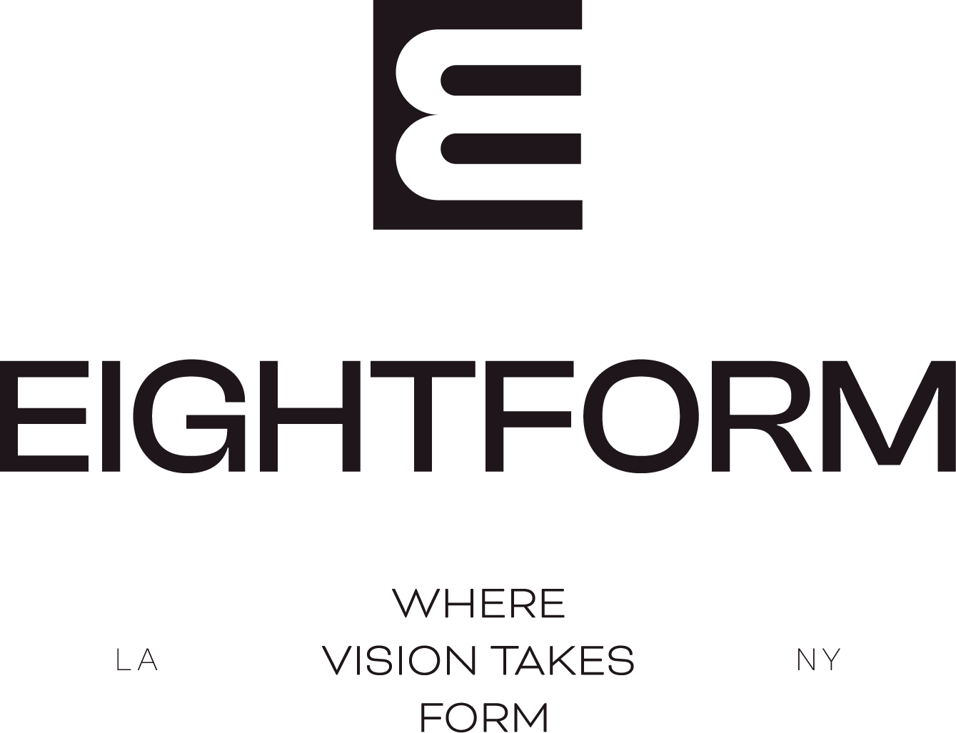
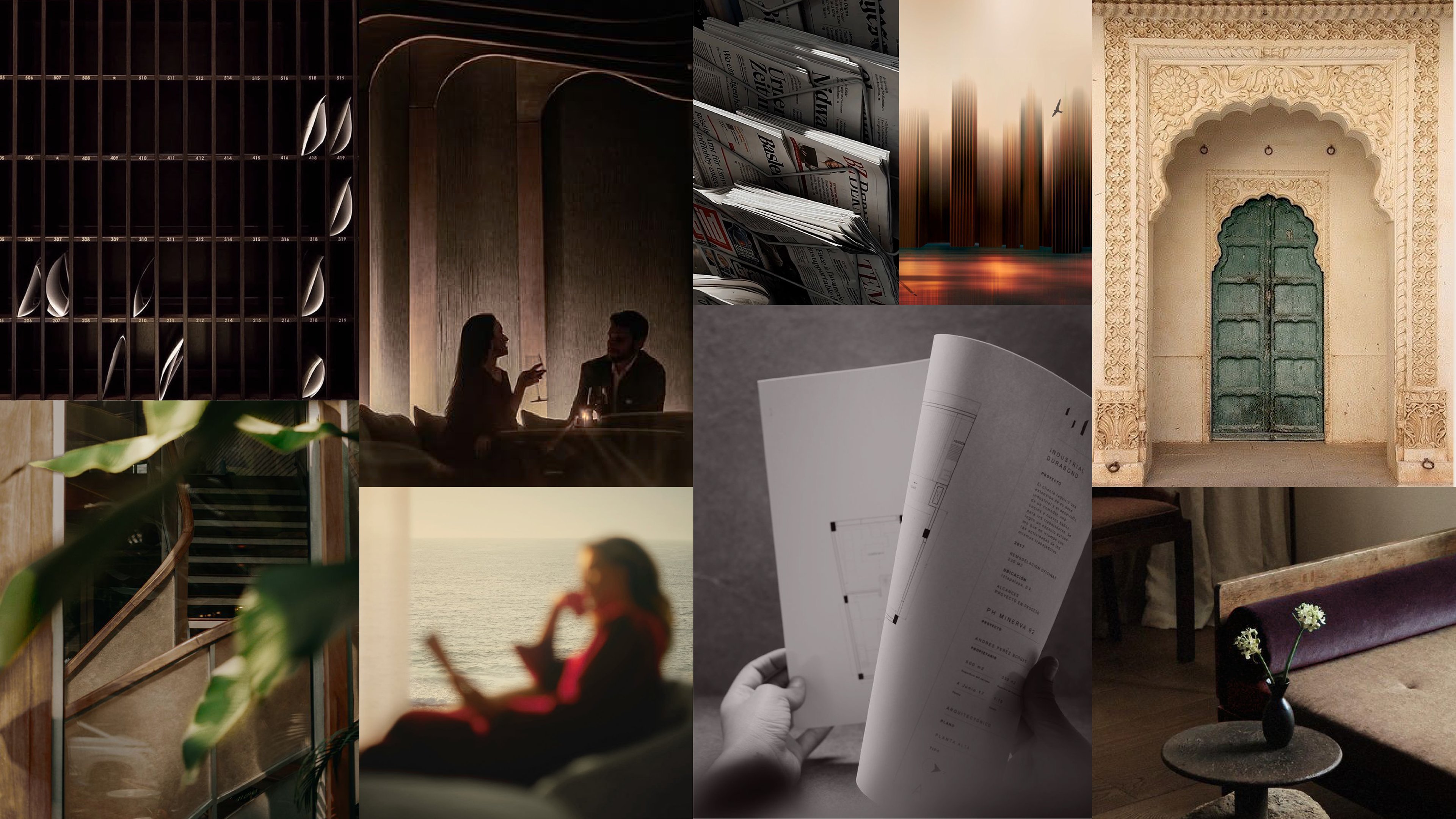
I developed the visual identity and creative direction for Eight Form, an institutional real estate development and asset management company focused on thoughtful development, disciplined investment, and long-term stewardship. The identity translates these principles into a refined visual language centered on precision, craftsmanship, proportion, and permanence—balancing the rigor of real estate with a sophisticated, design-forward sensibility.
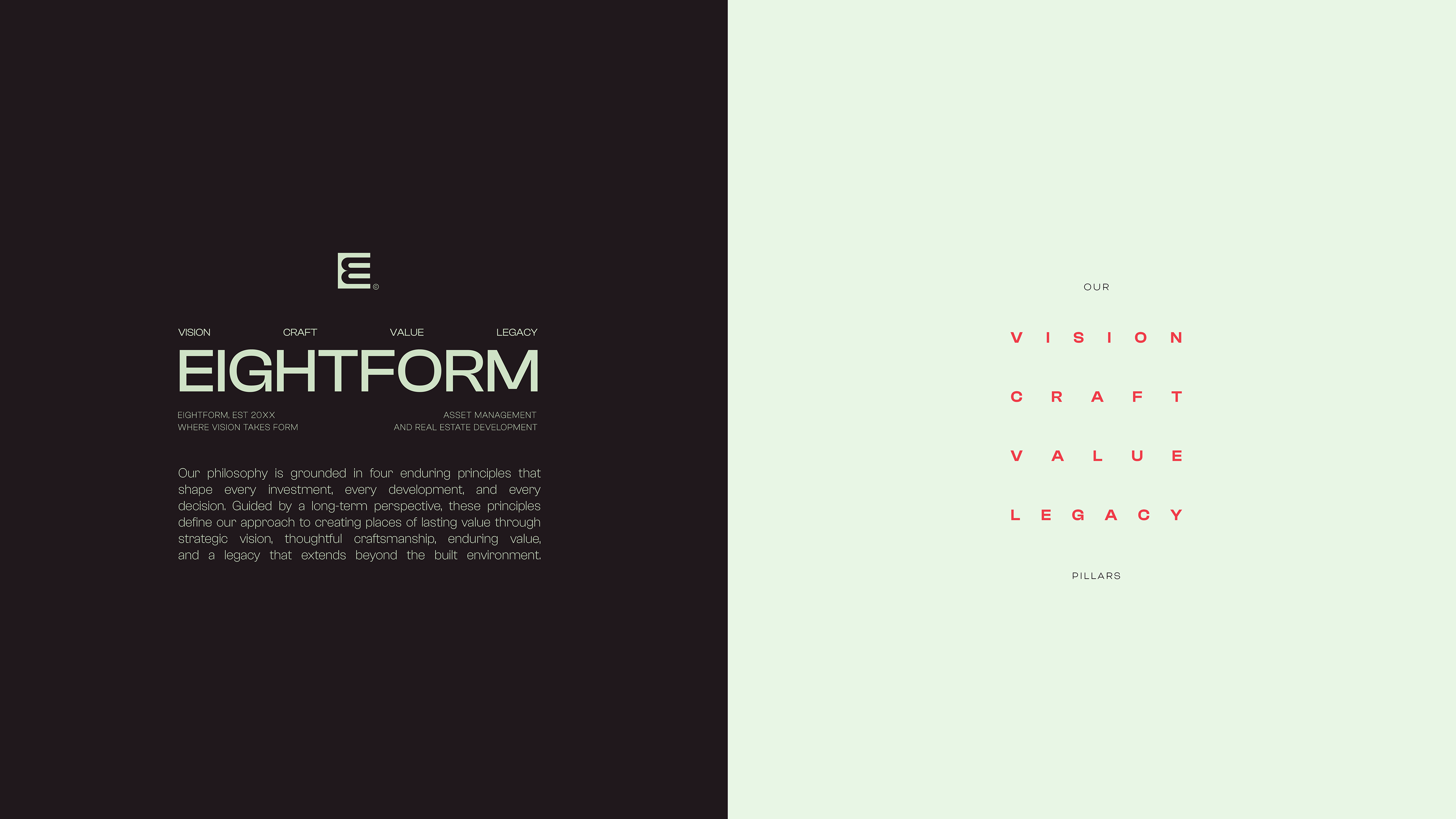
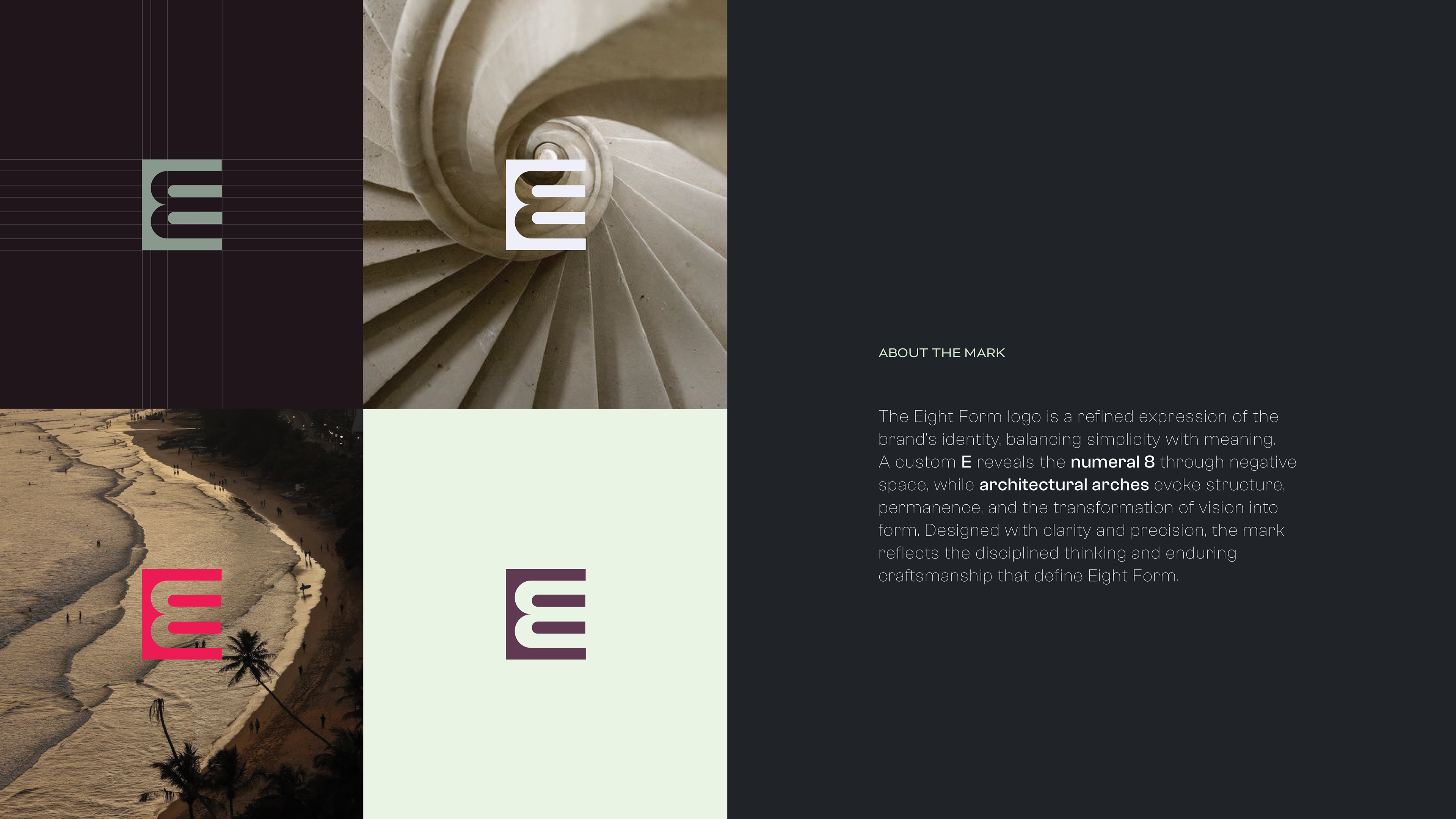
At the center of the identity is a custom “E” mark that reveals the numeral eight through negative space. Its architectural arches reference structure, permanence, and the transformation of vision into form, creating a mark that is simple at first glance but layered with meaning. Across the broader identity, I carried these ideas through typography, color, imagery, and brand applications to create a visual system that feels established, intentional, and built to endure.
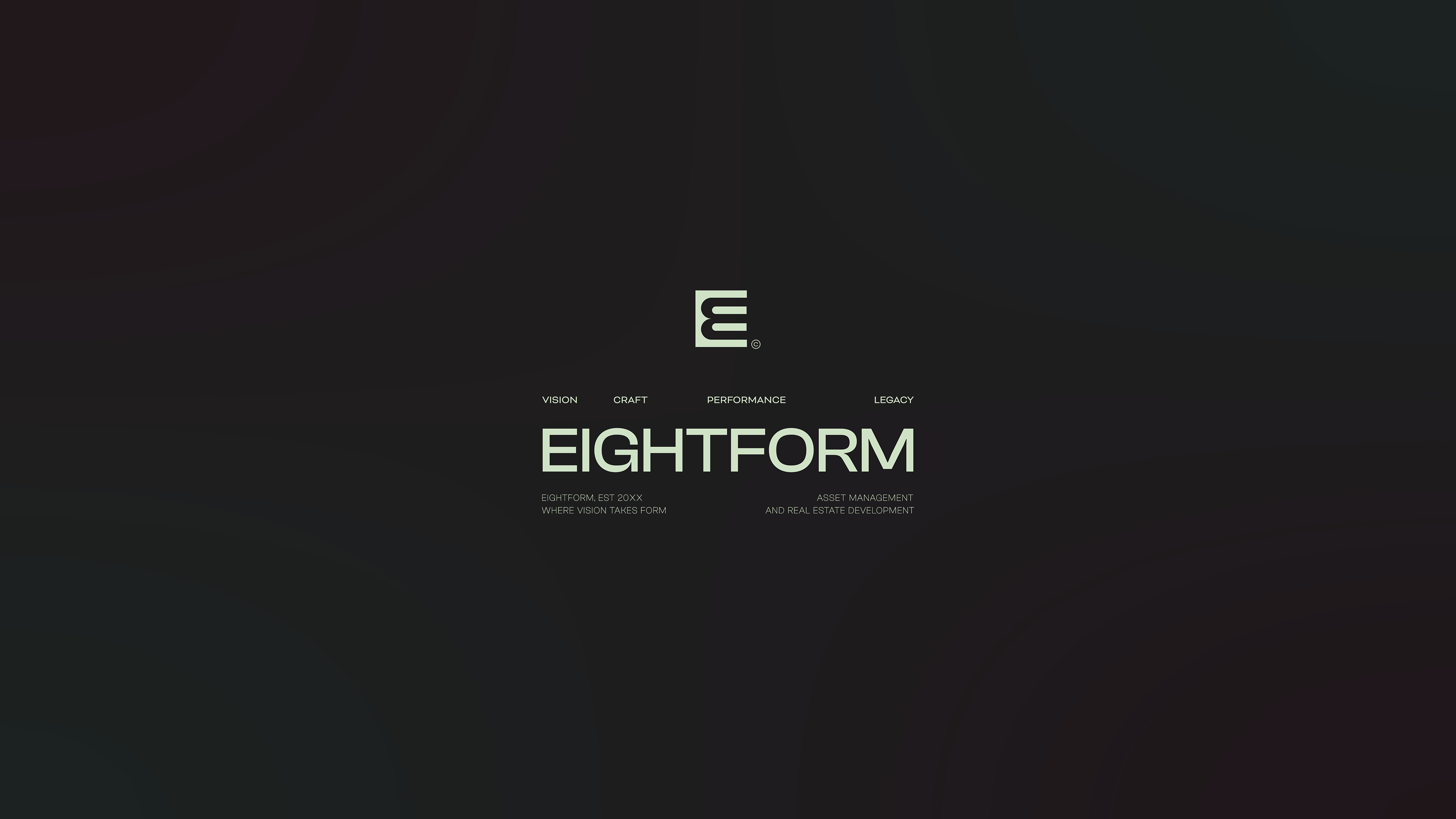
WEBSITE DESIGN – UI
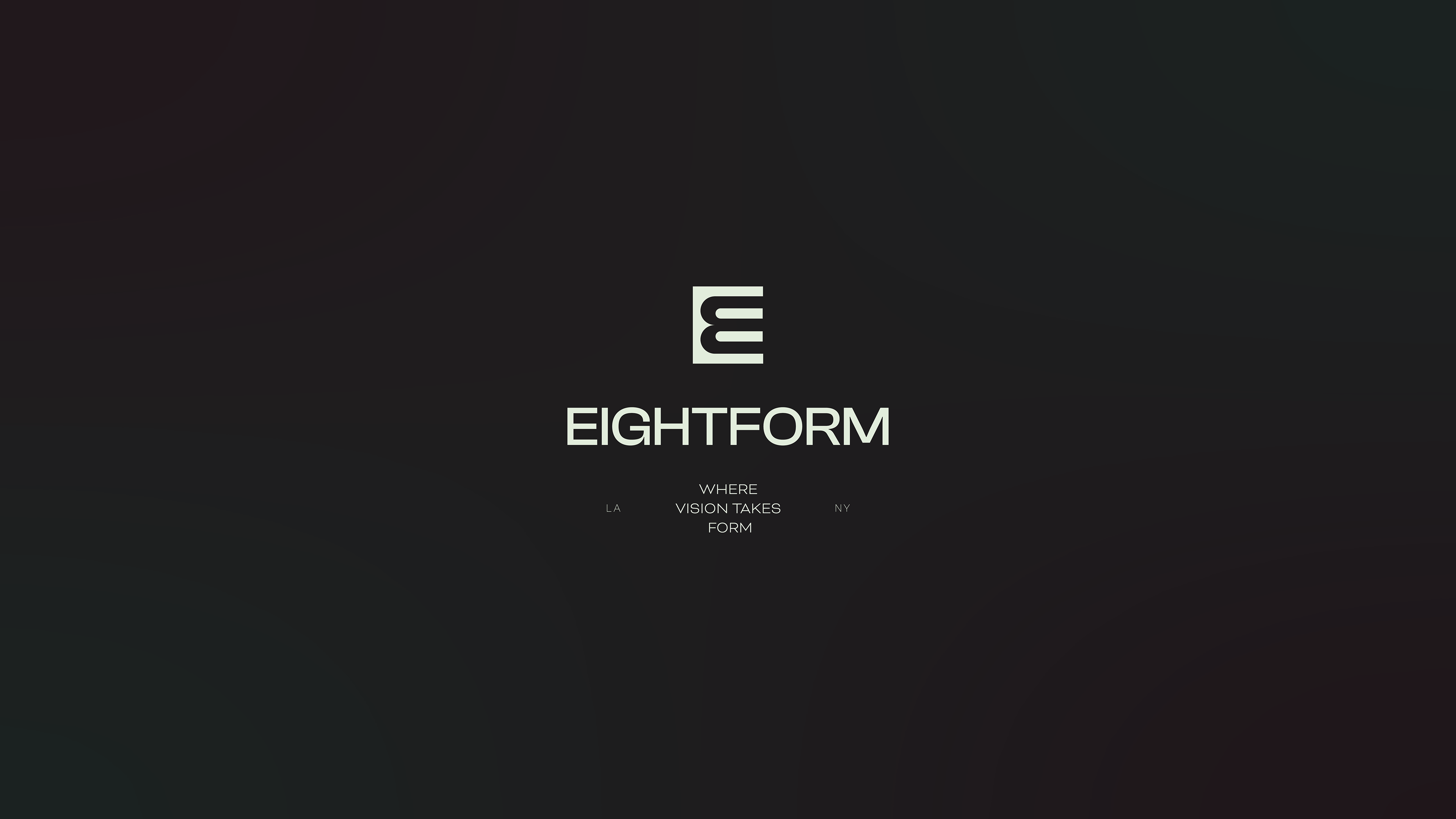
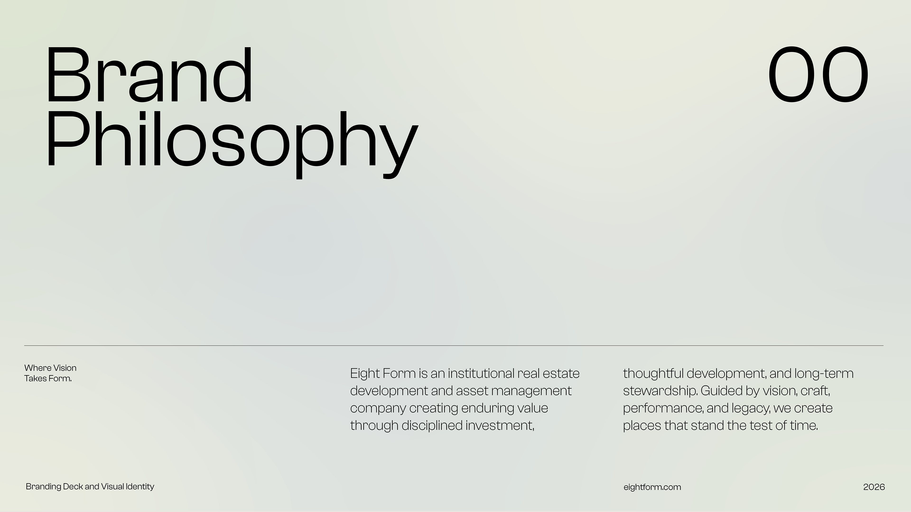
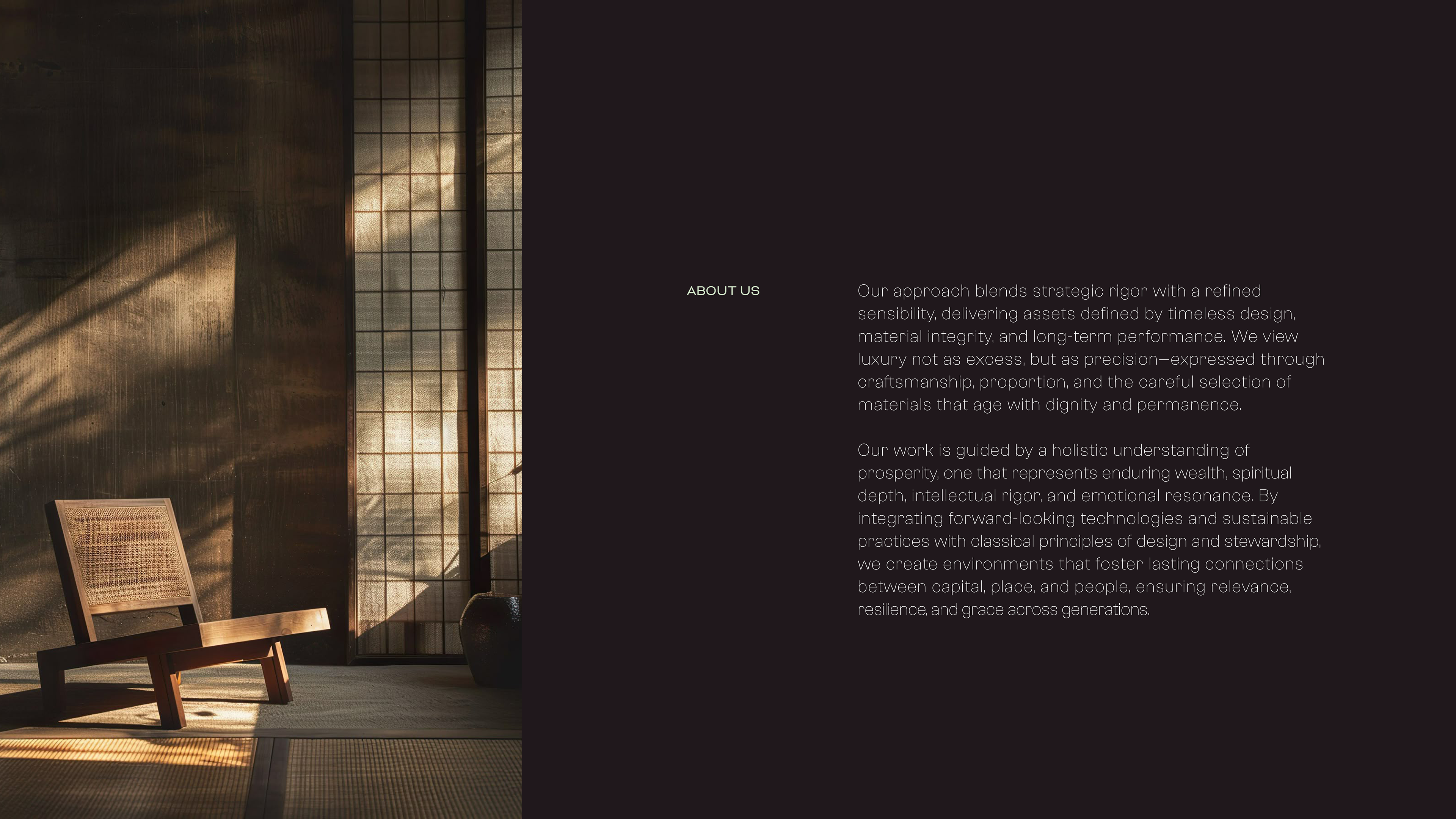
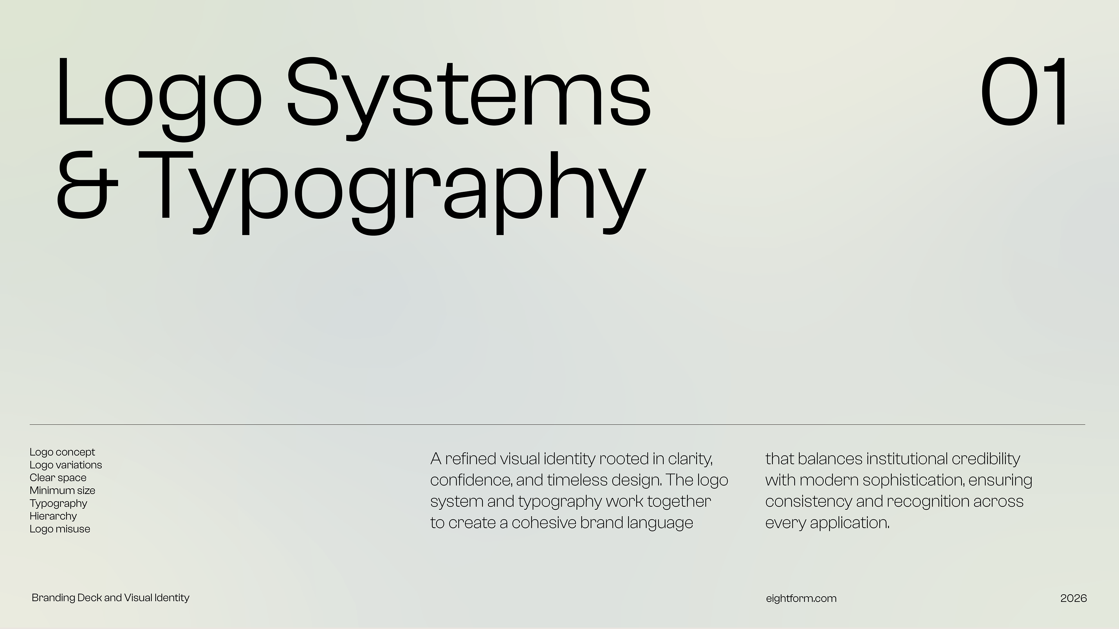
The Eight Form website was designed as an intentionally minimal and open-ended expression of the brand. Rather than defining the company by a fixed list of services or capabilities, the experience focuses on the “why” behind what Eight Form does—creating space for possibility and allowing the brand to evolve with the opportunities ahead. Each section communicates a guiding principle, philosophy, or point of view rather than simply explaining what the company does.
The result is a quiet, editorial digital experience that invites interpretation while establishing a clear sense of who Eight Form is. Through restrained typography, imagery, and thoughtful pacing, the site communicates confidence without over-explaining—leaving the possibilities intentionally open.
LINKEDIN POSTS